
I usually post about architecture once a week, showing off something I've found and love in the built art scene. Today I want to veer from that path and talk about packaging and branding. In my search for careers after school, I've realized how interesting packaging is to me. With my new iPhone, for example, a simple envelope was used to hold the instruction manual.
If you take a look at the envelope, you'll notice a semi-circular tab that sticks up. In the box, it is accessible through a hole in the cup that holds the phone. When you pull the tab, it allows you to remove the cup and envelope and access the cords beneath. The packaging is primarily white with dark grey text and has a soft, matte finish. Is it just me, or is that insanely cool and simple? Apple has always been known for setting standards of ultra-chic minimalism, and I think this box is a great crossover between a two-dimensional brand identity and three-dimensional packaging.
Now let me talk about Starbucks. I'm not a coffee-drinker, so I only frequent the cafes, well, infrequently, but I very much admire their strong branding and cohesive packaging. There's something comforting about the rich green and brown/black color scheme that always makes me feel warm. Starbucks has branched out into lots of branches of the coffee market, including at-home brews, single-serve envelopes, and reusable mugs and cups.
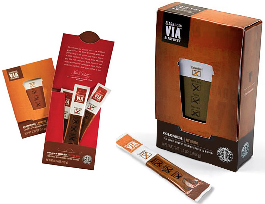

Though they tend to use variations on a theme, they remain loyal to the same colors, fonts, and the all-too-well-known icon of the siren. It was announced early this year that the siren would be "freed" from the Starbucks Coffee ring and used as a stand-alone logo more artistically. I'm think it's really fascinating how much life can be added to a brand image by simply layering the logo over a fold in the packaging, or zooming in on the image to highlight a specific aspect of the siren's image. Even more exciting to me is the re-allocating of colors. By strategically throwing in pops of a brighter green hue with the existing forest green, the logo has become fresh and new, signalling a new era for Starbucks. The unleashed siren also lends a simplicity to the branding that is quite the refreshing rage in contemporary marketing.
Check out this article for more information. So what do you think? Is this half as cool to anyone else as it is to me?
No comments:
Post a Comment
Well aren't you a cool kid. Thanks for dropping me a line!